Why Every Click Matters in UX Design
Most of the time we don't think about clicking. You click a button, a page opens, you search for something, you move on. Nobody's sitting there analyzing it in the moment.
But from a UX angle, that click still matters, even if nobody's thinking about it while it happens.
Say you're buying a jacket online. You want to check the size, chuck it in the cart, pay, be done with it. Every step should be dragging you closer to that. So what happens when the size chart is buried five pages deep? Or the "Add to Cart" button decided to hide? Or, and this one's my personal favorite, you have to make an account before the site will even tell you what shipping costs?
None of that ruins things on its own. It's the pile-up that gets you.
There's one question I keep coming back to for any step in a design: why does someone need to click this at all? If you can't answer that fast, that's usually the tell that something needs fixing.
More clicks isn't automatically the villain
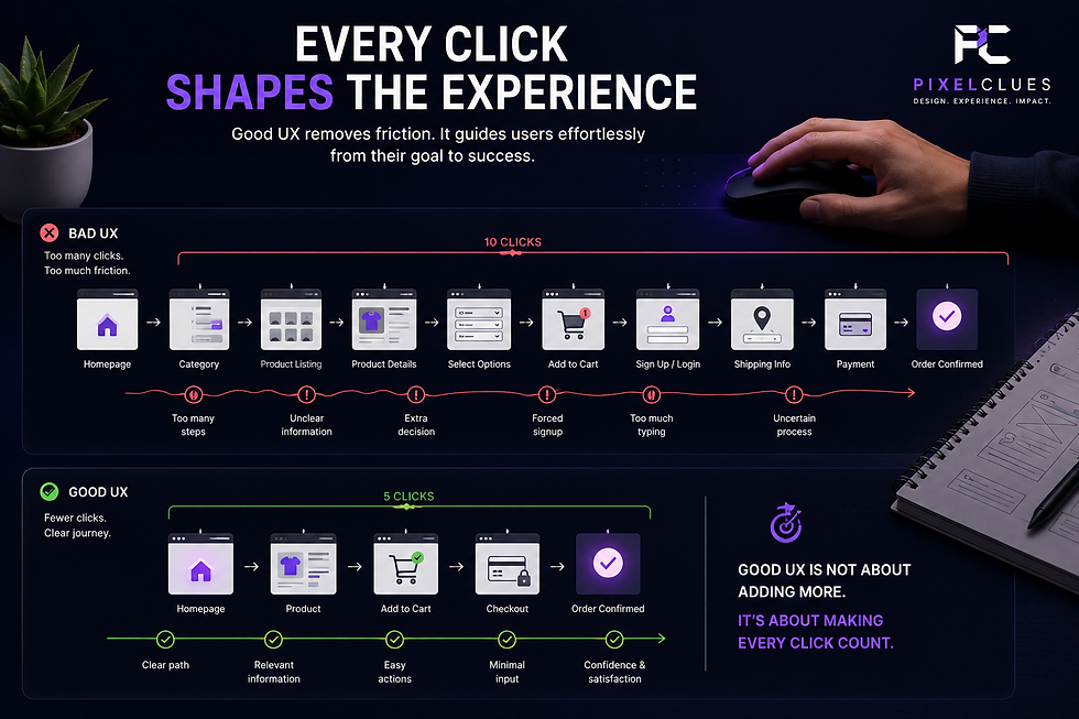
People love saying good UX means fewer clicks. I don't really agree. Sometimes one more click is the whole point. Ask someone to pick a category before dumping eight hundred products on them, and you've actually done them a favor, even though you technically made them click more.
So "fewer clicks" was never really the goal. The goal is clicks that make sense. A good click just feels obvious, like yeah, of course that's what happens now. Most of that comes down to labeling, honestly. "Continue" tells you nothing. "Continue to Payment" tells you everything. Tiny difference, outsized effect.
The real problem is making people stop and think
Want to wreck a UX? Make someone click something and get a result they didn't see coming. Do it twice and they're gone. No drama, no complaint, just gone.
It's weirdly easy to forget how many little decisions hide inside stuff that sounds dead simple. Searching.
Signing up. Buying something. Booking a thing. Trying to find a phone number on a site that clearly doesn't want you to call. Filling out a form. A form can look gorgeous and still be a nightmare if it's asking for stuff it doesn't need, or the error message just says something went wrong and leaves you there.
Looking nice was never the whole job. Feeling obvious is.
Say what happens next
Here's something I actually care about: once someone does a thing, does the page bother telling them it worked?
You submit a form and nothing happens. No message, no checkmark, nothing. There's this little half-second of "wait, did that go through, do I click it again?" That flicker of doubt is part of the experience too, even though nobody designed it on purpose.
None of it is small, actually

A button. A menu. A confirmation message. A search result that either gets you there or doesn't. Individually, sure, none of it seems like much. Put it all together, though, and that's the entire experience, as far as anyone using it is concerned.
The point was never "click less." It's knowing, before you click, roughly what's about to happen. Nail that and people stop noticing the interface at all. They just do the thing they came to do and move on with their day. And honestly, that's the real tell that a UX is working, when nobody even mentions it.
What's a site or app where every click just feels right to you? Drop your thoughts, and follow PixelClues for more on UI/UX, gaming, design psychology, and the decisions behind good digital experiences.

Comments