Why Simplicity Is One of the Hardest Things to Design
Look at a simple website and it's easy to assume the design side was the easy part. Fewer colors. Fewer buttons. Less crammed onto the screen. It all looks tidy, so surely it didn't take much.
It's the opposite, usually. Simplicity isn't about subtracting until there's nothing left. It's about knowing what actually matters and cutting the rest.
Anyone can add another animation, another image, another button. That part's easy. The hard part is deciding what the user actually needs which is exactly why a simple, useful design can take more work than a busy one, not less.
Simple isn't the same as empty
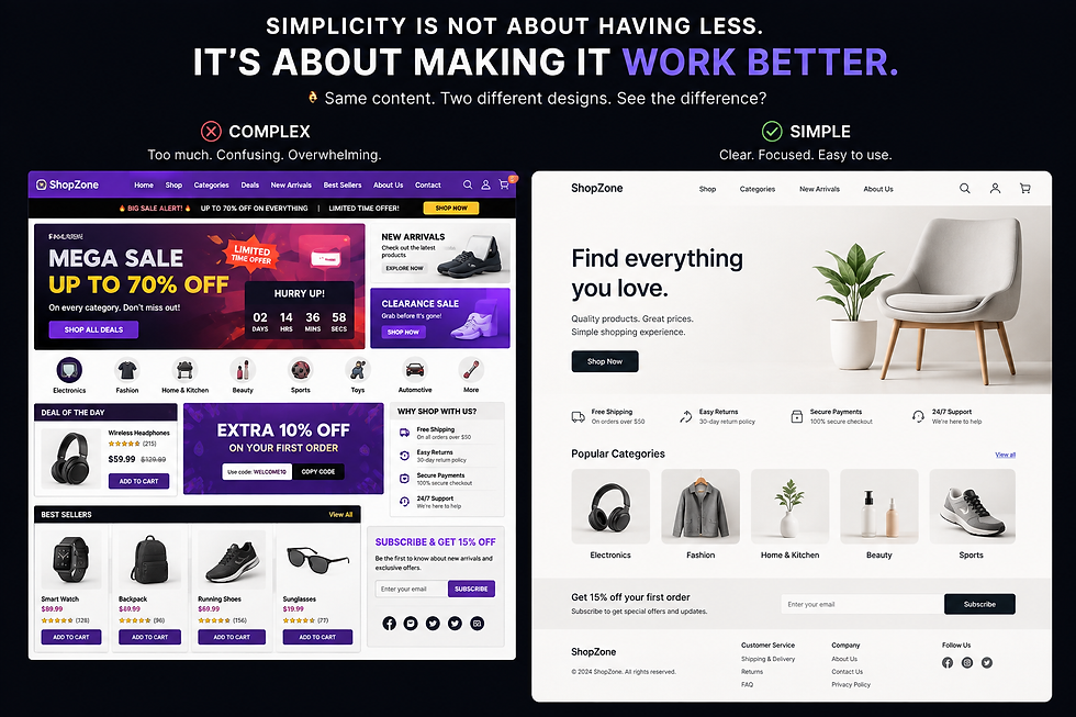
People mix these up a lot. A logo and one button on an otherwise blank page might look clean, sure. But clean isn't the same as good. You'd probably still be sitting there wondering what the site even does, or where you're supposed to click next.
Take an online store. It still needs product photos, prices, navigation, search, reviews, a checkout button cutting those wouldn't make it simpler, it would just make it worse. The trick isn't fewer pieces. It's arranging the pieces so they make sense to whoever's using them.
So the goal was never "remove everything." It's keep what's useful, cut what isn't. That's most of what UI/UX work actually is figuring out what matters and how people move through a screen. The result might look effortless. The thinking behind it rarely is.
Everything on the screen needs a job
Adding is the easy move. Page feels a little bare throw in an image. Section feels flat add an animation. A button just looks nice, so it goes in too.
But stacking on elements doesn't make things better. Everything on a screen is competing for someone's eyes, and if all of it is shouting, none of it lands. That's the whole point of visual hierarchy.
If the page exists to get people to sign up, the sign-up button should be the thing your eye hits first. Other options can stick around, but they shouldn't be arm-wrestling the main one for attention. Designers pull this off with spacing, type, color, size, position nothing fancy, just tools for saying "look here first, then here." When it works, people don't have to think about how to use the thing. They just use it. That's most of the payoff.
Cutting is the hard part, not adding
Removing something is harder than adding it, almost every time. A page feels sparse and the instinct is always to fill it in. Before doing that, it's worth pausing on a few questions: Does this actually help? Does it make anything clearer? Does it serve the point of the page? Is it necessary or did it go in because it looked good, not because it does anything?
If there's no real answer, it probably shouldn't be there. That's not an argument for stripping every design down to nothing some products need more, genuinely. But whatever's on the screen should be able to justify itself. Good design isn't just choosing what to add. It's choosing what to leave out, on purpose.
The part nobody sees
Here's the thing about a good simple design nobody ever sees the work that went into it. The finished page might be a heading, one image, a line of text, a button. But someone probably spent hours arguing with themselves over where that button goes, how much space sits between sections, what appears first, what should stand out, what gets cut.
None of that shows up individually. Together, it's the whole difference. So simplicity isn't a lack of ideas if anything, it's the opposite. Sometimes the most creative decision a designer makes all day is choosing not to add something.
In the end, it's about clarity
Good simplicity just means things are clear. Website, app, game, whatever people should be able to look at it and know what it is and what to do next.
The best simple designs aren't simple because someone ran out of ideas. They're simple because someone figured out which ideas the user actually needed. So next time a site looks almost too easy, don't assume it was easy to make. There were probably a hundred small decisions sitting under that one clean screen.
Sometimes the best design is the one you don't even notice you just use it and think "oh, that was easy." Making something feel that easy might be the hardest part of the whole job.
What's a site or app you think gets this right? Drop it below, and follow PixelClues for more on UI/UX, gaming, and the decisions behind the stuff you use every day.

Comments